
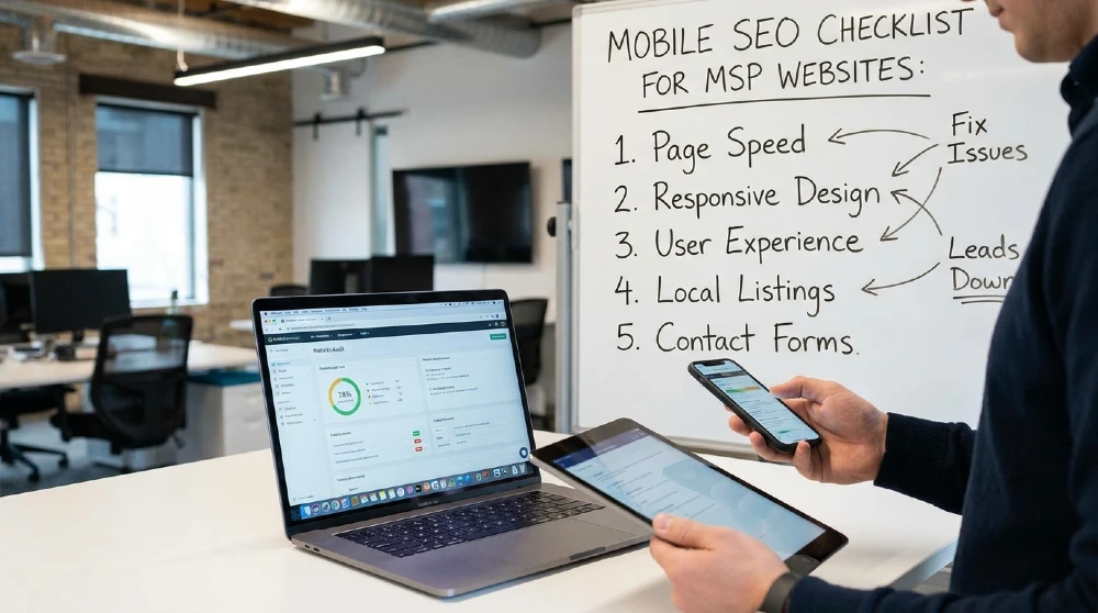
A mobile SEO checklist for MSP websites should cover speed, design, navigation, forms, and technical basics because Google now ranks every site using its mobile version, and most of your prospects are researching managed IT providers on a phone. If your mobile site is slow, cluttered, or hard to tap through, you’re losing leads before your sales team ever hears about them.
Since 2024, Google has used mobile-first indexing for 100% of sites. That means the mobile version of your MSP website not the desktop one is what Google actually crawls, indexes, and ranks. A polished desktop site with a rough mobile experience will still underperform in search, on every device.
This checklist walks through exactly what to check, in order, so you can find and fix mobile SEO problems on your MSP site.
Why Mobile SEO Matters for MSP Lead Generation
Mobile SEO for MSP websites matters because a large share of your prospects, often more than half, are searching for managed IT services on a phone, even if they later switch to a desktop to fill out a form. If that first mobile visit is a poor experience, many won’t come back.
How Mobile Visitors Behave Differently on Service Pages
Mobile visitors scan rather than read. They’re often comparing two or three MSPs in separate tabs, sometimes while doing something else entirely, walking between meetings, sitting in a car park, half-listening in on a call. That means:
- They want the answer to “what do you do” within the first screen, no scrolling.
- They’re more likely to tap a phone number than type out a long enquiry.
- They abandon a page fast if it doesn’t feel usable straight away.
Service pages built for a desktop reader long paragraphs, small buttons, dense navigation don’t hold up well under these conditions.
Why Slow, Hard-to-Use Mobile Sites Lose Managed IT Leads
A mobile site issue doesn’t just cost you a bit of traffic it costs you the lead entirely. Someone comparing MSPs on their phone at 9pm isn’t going to fight with a broken layout to find your contact details. They’ll move to the next search result.
This is the core reason mobile user experience for service-based websites deserves its own checklist, separate from general SEO. It’s not only about rankings it’s about whether the visitors you’ve already earned actually convert.
Mobile Page Speed on Your MSP Site
Mobile page speed on your MSP site should keep Largest Contentful Paint under 2.5 seconds and responsiveness (INP) under 200 milliseconds on your homepage, service pages, and contact page. Anything slower and you’re likely losing mobile visitors before they see your offer.
Checking Load Time on Key Service and Contact Pages
Test your most important pages individually not just your homepage using Google PageSpeed Insights or a similar tool, checked on the mobile tab specifically. Focus on:
- Homepage
- Your two or three highest-traffic service pages
- Contact and quote-request pages
These are the pages doing the actual lead-generation work, so a slow load here is the most expensive delay on the site.
Simple Speed Fixes That Help Mobile Visitors Convert
Most MSP sites can improve mobile page load time with a handful of changes:
- Compress and resize images for mobile screens
- Turn on caching
- Remove unused or duplicate tracking scripts
- Avoid autoplay video on mobile
- Lazy-load anything below the first screen
For a deeper breakdown of speed’s direct effect on conversions, it’s worth pairing this checklist with a full MSP SEO strategy focused on ranking on Google, since speed and visibility work together rather than as separate projects.
Mobile-Friendly Design and Layout
A mobile-friendly MSP website uses a single responsive layout that adapts cleanly to any phone screen, with readable text and no horizontal scrolling. This is still the baseline Google expects, and it’s also what keeps visitors from leaving out of frustration.
Responsive Pages That Fit Common Phone Screens
Responsive design means one set of content and code that reshapes itself for the screen it’s viewed on, rather than a separate stripped-down mobile version. Google explicitly recommends this over old-style “m.” subdomains, which are now considered a legacy approach and add unnecessary maintenance.
Check your pages on a few common screen widths a small phone, a standard phone, and a larger phone to confirm nothing overlaps, gets cut off, or forces awkward zooming.
Readable Text, Clear Buttons, and No Horizontal Scrolling
A few basics catch most mobile usability issues:
- Body text should be readable without pinching to zoom (generally 16px or larger)
- Buttons and tap targets should be large enough to tap accurately with a thumb
- No content should force the page to scroll sideways
- Confirm the viewport meta tag is set correctly so the page scales to the device width instead of loading a shrunk-down desktop layout
If any of these fail, it’s usually a quick template fix rather than a full rebuild.
Navigation and Menus on Mobile Devices
Mobile navigation on an MSP site should get a visitor to your services, pricing, and contact page in one or two taps from anywhere on the site. If your menu takes more taps than that, or hides key pages behind vague labels, you’re adding friction right before the moment someone’s ready to convert.
Easy Access to Services, Pricing, and Contact Pages
These three page types matter more than any other on an MSP site, so they should never be buried:
- Services — what you actually do, in plain language
- Pricing or “get a quote” — even if pricing isn’t public, a clear next step should be
- Contact — visible from every page, not just the homepage
A mobile menu with 15 items and no clear hierarchy makes visitors hunt for the two or three pages that actually matter to them.
Mobile Menus and Links That Work in One or Two Taps
Test your own mobile menu the way a prospect would:
- Open the hamburger menu — does it open instantly, without lag?
- Tap “Services” — does it go straight there, or through an extra sub-menu?
- Tap “Contact” — is the form or phone number visible without more scrolling?
If any of these takes more than two taps, simplify the menu structure. This is also a good moment to check that your internal links reflect how prospects actually search for example, linking service pages to supporting content like MSP keyword research so both users and Google can follow a logical path through the site.
Forms, Click-to-Call, and Lead Capture on Mobile
Mobile forms and lead capture on an MSP site need to work with a thumb and a small keyboard short fields, big buttons, and a tap-to-call option that actually dials. This is where mobile SEO turns directly into mobile leads.
Contact and Quote Forms That Are Easy to Use on Phones
Long, desktop-style forms are one of the most common places mobile visitors give up. Keep it simple:
- Ask for only what you truly need at this stage (name, email, phone, one message field)
- Use appropriate input types (a numeric keyboard for phone number fields, for example)
- Make the submit button large and clearly labelled
- Show a clear confirmation once submitted, so visitors know it worked
Tap-to-Call Buttons and Chat Widgets That Actually Work
Click-to-call buttons are one of the highest-converting actions on a mobile MSP site a prospect can go from “reading your page” to “talking to a person” in one tap. Test that your phone number:
- Is a proper tap-to-call link (
tel:) rather than plain text - Sits somewhere visible without scrolling, ideally in the header
- Is repeated near the bottom of longer service pages
If you use a chat widget, confirm it doesn’t cover the tap-to-call button or block form fields on smaller screens — a surprisingly common conflict.
Technical Mobile SEO Basics for MSP Websites
The technical mobile SEO basics for MSP websites come down to two things: making sure Google can actually crawl and index your mobile pages, and keeping titles, canonicals, and local signals consistent between mobile and desktop. Since mobile-first indexing applies to every site, gaps here affect your rankings everywhere, not just on mobile.
Making Sure Mobile Pages Are Crawlable and Indexed
Because Google now indexes the mobile version of your site by default, anything missing from mobile but present on desktop is effectively invisible to search. Check that:
- Mobile pages aren’t accidentally blocked in robots.txt
- Images, videos, and structured data appear on mobile, not just desktop
- Internal links present on desktop also exist on mobile
- Content isn’t hidden behind interactions that Googlebot can’t trigger
You can confirm mobile-first indexing status and crawl issues directly in Google Search Console under the Settings and URL Inspection sections.
Consistent Titles, Canonicals, and Local Signals on Mobile
Title tags, meta descriptions, and canonical tags should match exactly between mobile and desktop versions of the same page. Mismatches here can confuse how Google interprets and ranks the page.
Local SEO for MSP websites also depends on this consistency location information, service-area details, and structured data need to be present on mobile, since that’s the version Google evaluates for local search and map results. If you serve specific regions, this is a good point to double-check your location-based MSP keyword research lines up with what’s actually on the mobile page.
How to Test and Monitor Mobile Performance Over Time
Testing and monitoring mobile performance means checking usability and speed with the right tools regularly, then tracking whether mobile leads actually go up after fixes not just whether a score improves.
Simple Tools to Check Mobile Usability and Speed
A short, repeatable toolkit covers most of what you need:
| Tool | What it checks |
|---|---|
| Google Search Console | Mobile-first indexing status, crawl errors, Core Web Vitals |
| Google PageSpeed Insights | Mobile page speed (LCP, INP, CLS) |
| Browser device toolbar | Layout on different phone screen sizes |
| Manual phone test | Real tap targets, forms, and click-to-call behaviour |
Run through this list after any major site change, not only when something looks broken.
Watching Mobile Leads and Conversions After Fixes
Once you’ve made mobile SEO fixes, filter your analytics by device and compare mobile form submissions, calls, and chat starts for a few weeks before and after. A rise in mobile conversion rate is the real confirmation that the fixes worked — a better test score is only a means to that end.
If mobile leads improve but overall visibility still has room to grow, it’s worth expanding into longer, more specific search terms too — see this guide to long-tail keywords for MSPs for the next step once your mobile experience is solid.
In short: mobile-first SEO for B2B websites like MSPs isn’t optional in 2026 it’s how Google evaluates your entire site, on every device. Working through this checklist in order (speed, design, navigation, forms, technical basics, then monitoring) fixes the issues most likely to be quietly costing you managed IT leads.