
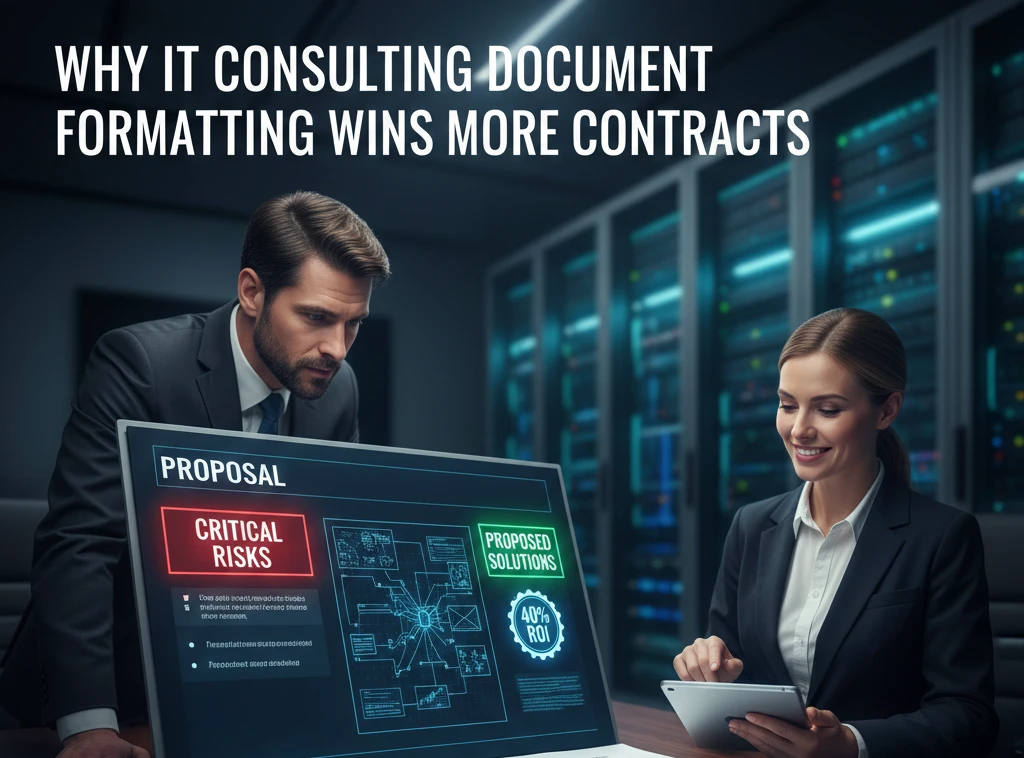
In the high-stakes world of IT consulting, your technical brilliance is often judged by something surprisingly non-technical: the way your documents look. You can have the most advanced cybersecurity framework or a groundbreaking cloud migration strategy, but if your proposal looks like a cluttered “information wall,” you’ve already lost the room.
The problem is simple. Busy CTOs and decision-makers don’t have time to hunt for the value. In 2026, professional document formatting isn’t just about aesthetics; it’s a strategic bridge between your complex data and an executive’s “Yes.”
| Formatting Element | The Consultant’s Edge | The Client’s Benefit |
| White Space | Signals precision and clarity. | Reduces “Technical Fatigue.” |
| BLUF (Bottom Line Up Front) | Positions you as a strategist. | Immediate clarity on ROI/Risk. |
| Consistent Hierarchy | Demonstrates rigorous SOPs. | Faster scanning for key takeaways. |
| Interactive Navigation | Shows tech-forward thinking. | Seamless jumping between sections. |
1. Formatting as a Proxy for Technical Rigor
When a CIO opens a 40-page technical audit, their brain is scanning for patterns before they read a single word. If they see mismatched fonts, broken tables, or blurry diagrams, they make an instant subconscious leap: “If they are this sloppy with their report, how sloppy are they with my server architecture?”
In IT, precision is everything.
Poor formatting sends a “lazy signal.” It suggests that you didn’t care enough to finalize the small details. In 2026, where the market is flooded with “AI-generated” generic content, a perfectly formatted, human-polished document stands out as a mark of true authority. It’s the difference between being a vendor and being a trusted advisor.
2. The Psychology of Cognitive Load
IT consulting deals with “Intrinsic Load”—the natural complexity of things like API integrations or Zero Trust models.
You cannot change the complexity of the tech. But you can stop adding “Extraneous Load.” This is the mental friction caused by poor layout. If a reader has to work hard just to find the “Price” or the “Security Risk,” they get frustrated.
And frustrated clients don’t sign contracts. By using wide margins, short paragraphs, and clear focal points, you lower the “Cognitive Demand” on the reader. You make it easy for them to agree with you.
3. The “Power Move”: Scannability and Visual Cues
Decision-makers are scanners, not readers.
They will flip through your document looking for bold text, bullet points, and charts. If your most important point is buried in the third paragraph of page 12, it doesn’t exist.
- Use Bold Judiciously: Highlight the outcome, not just the feature.
- The 30-Second Rule: Can a stakeholder understand the “Problem” and your “Proposed Solution” just by reading the headers? If not, rewrite the headers.
- Diagram Integrity: Never use pixelated screenshots of a network map. Use clean, high-resolution exports. When they zoom in on a tablet during a board meeting, your work should remain crisp.
4. Authoritative EEAT: Why Trust Starts with the Page
Google’s E-E-A-T (Experience, Expertise, Authoritativeness, and Trustworthiness) isn’t just for websites—it’s the backbone of professional consulting.
Experience is shown when you include real, formatted data logs or case-specific screenshots.
Expertise is proven through a logical information hierarchy.
If you want to be viewed as a leader, your documents must look like they were authored by one. Consistency across 100 pages is a difficult task—that’s exactly why doing it perfectly proves your firm’s operational excellence.
FAQs: Mastering the Consultant’s Document
1. Does professional formatting really impact my billable rates?
Yes. Perception is reality. Firms that deliver “Premium” reports can often justify 15-25% higher rates because they are viewed as higher-tier specialists who value the client’s time.
2. What is the biggest “Deal-Killer” in a technical proposal?
A table that breaks across two pages without repeating the header row. It’s a small thing that makes your data impossible to read and looks incredibly amateur.
3. Should I use more bullets or more paragraphs?
Use a mix. Paragraphs are for explanation; bullets are for action. In 2026, the best reports use a “1-2-1” pattern: a short intro sentence, 3-4 bullets, and a concluding insight.
4. Is a “Table of Contents” necessary for short reports?
If it’s over 5 pages, yes. It provides a roadmap. For digital PDFs, make sure the TOC is hyperlinked so the client can jump to the section they care about with one click.
5. How do I handle “Dry” technical data?
Use “Call-out Boxes.” Put the most critical data point in a shaded box with a border. This pulls the eye away from the boring text and highlights the value.
6. Why is “White Space” considered a professional tool?
White space prevents “Information Overload.” It frames your content and makes the text that is on the page feel more significant.
7. Can I just use a standard Word template?
Standard templates are better than nothing, but they look “standard.” Customize your styles to match your brand’s visual identity to create a cohesive professional experience.