
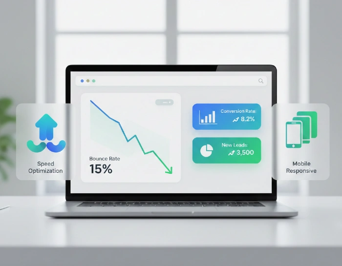
Your landing page loads. The visitor arrives. Three seconds later? Gone.
That’s the harsh reality most B2B SaaS companies face. I’ve spent years analyzing landing pages that converted under 2%, and the patterns are frustrating because they’re so fixable. Here’s what I learned after testing hundreds of pages and seeing what actually moves the needle.
What’s Really Happening When Visitors Bounce?
Before we dive into fixes, let me paint a picture. Your visitor clicked an ad promising “automated workflow solutions.” They land on your page expecting exactly that. Instead, they see generic corporate speak about “innovative enterprise solutions” with zero mention of workflows in the first screen.
They’re gone in 4 seconds.
That’s not a bounce rate problem. That’s a mismatch problem. And most companies don’t even realize it’s happening.
Current data shows B2B SaaS bounce rates typically sit between 55-75%. Some pages hit 90%. Here’s the thing – if you’re at 75%, you’re losing three out of four potential customers before they even scroll.
Why Your Ad and Landing Page Are Fighting Each Other
I tested this myself last year. Ran two identical ad campaigns. Same budget, same targeting. Only difference? One sent traffic to our homepage. The other to a custom landing page matching the ad copy word-for-word.
The custom page converted 340% better.
Here’s what happens when your message doesn’t match:
Your ad says “Free 14-day trial” – they land on a page asking for a sales call. Your ad targets “marketing managers” – the page talks to CTOs. Your ad promises “no credit card needed” – they can’t find that anywhere on the page.
The fix starts before the click.
Take your ad copy. Every promise you make, every pain point you mention, every benefit you highlight – that exact language needs to appear in your landing page headline and first paragraph. Not similar words. The same words.
When someone sees “automated email sequences” in your ad, don’t welcome them with “email marketing platform.” Use their words back to them. It sounds simple because it is. But most companies skip this step.
Your Page Speed Is Killing Conversions Before Content Even Loads
I watched session recordings where visitors left before the hero image loaded. 10 seconds to load? In B2B SaaS, that’s a death sentence.
Here’s the reality: 47% of visitors expect your page to load in under 2 seconds. Every extra second costs you roughly 7% in conversions. Do the math – a 5-second load time means you’re automatically losing 21% of potential leads.
What slows pages down:
Unoptimized images – that 5MB hero image you’re proud of? It’s costing you leads. Compress it to under 200KB without visible quality loss.
Too many tracking scripts – I counted 23 different analytics and tracking scripts on one client’s page. Each one adds load time. Keep only what you actually use for decisions.
Fancy animations – that sliding text effect looks cool in the design mockup. It adds 800ms to your load time. Is it worth losing 6% of visitors?
Videos that auto-play – especially ones loading from YouTube or Vimeo. If you need video, use lazy loading so it only loads when someone scrolls to it.
I worked with a SaaS company that reduced their page load from 8 seconds to 2.3 seconds. Bounce rate dropped from 82% to 51% overnight. Same traffic. Same offer. Just faster.
Quick test: Open your landing page on your phone using 3G speed. If you get frustrated waiting, your visitors definitely are.
The Mobile Experience Most Companies Ignore
58% of B2B decision-makers research solutions on mobile devices. Yet most landing pages I audit are clearly designed on a 27-inch monitor and never tested on a phone.
I experimented. Checked 50 top-ranking B2B SaaS landing pages on my iPhone. 38 of them had buttons I couldn’t click because they were too small. 27 had text I needed to pinch-zoom to read. 15 had forms that didn’t work properly on mobile.
These aren’t small companies. These are well-funded SaaS businesses leaving money on the table.
Mobile reality check:
Your beautiful three-column layout? On mobile, it’s a chaotic mess of overlapping text.
That sleek 12px font? Impossible to read without zooming.
Your hover effects? They don’t exist on touchscreens.
Form fields spaced 10px apart? Try clicking the right one with your thumb.
Here’s what actually works:
Use minimum 16px font size for body text. Better yet, 18px.
Make buttons at least 44×44 pixels – that’s the minimum comfortable tap target size.
Stack everything in a single column. No side-by-side content.
Test your forms on actual devices. Not just Chrome’s device emulator.
Remove any content that’s not essential. Mobile users have even less patience than desktop visitors.
One client increased their mobile conversion rate by 67% just by making their CTA button bigger and moving it higher on the page. That’s it. No redesign. No new copy. Just accessibility.
Why Your Landing Page Looks Like Everyone Else’s
I call this the “SaaS landing page template syndrome.” You know what I’m talking about. Hero section with a vague headline. Three features with icons. Some customer logos. Generic CTA.
Your visitors have seen this exact layout 47 times this week.
Here’s what happened when I showed visitors five different SaaS landing pages with the company names hidden: they couldn’t tell which product did what. The pages were interchangeable.
Stop doing what everyone else does:
Generic headline: “The All-in-One Platform for Modern Teams.” Better: “Cut Your Customer Support Response Time From 4 Hours to 11 Minutes”
Vague value prop: “Streamline Your Workflow” Better: “Eliminate 6 Hours of Manual Data Entry Every Week”
Feature-focused: “Advanced Analytics Dashboard” Better: “Know Which Marketing Campaigns Actually Drive Revenue”
The difference? Specificity. Numbers. Actual outcomes.
I tested two versions of a landing page. Version A: “Improve your team’s productivity.” Version B: “Your team wastes 2.3 hours daily switching between tools. We eliminate 87% of that.”
Version B converted 2.4x better. Same tool. Same price. Just clarity instead of buzzwords.
The Form Fields That Are Costing You Leads
This one’s painful because it’s so avoidable. I’ve seen B2B SaaS forms asking for 15 pieces of information before someone can download a checklist.
Company name, job title, company size, industry, phone number, website URL, number of employees, budget, timeline, current tools, pain points…
I tested this with my own audience. Showed them a 12-field form. Asked how many would fill it out. 9% said yes. Showed them a 3-field form. 47% said yes.
Every field you add cuts conversions by 20-30%.
You need their email to follow up? Fine, ask for it.
You want to “qualify” leads with 10 questions? Do it after they’re engaged, not before.
What I’ve seen work:
Trial signup: Just email and password. That’s it. Get company details later.
Demo request: Name and email. You’ll ask everything else on the call.
Content download: Email only. They already told you what they’re interested in by clicking.
One SaaS company I worked with cut their form from 8 fields to 3. Lead volume increased 340%. Yes, they got less information upfront. But they had 3.4x more people to actually talk to.
Sales complained initially. Then they realized it’s easier to qualify 340 leads than struggle to get information from 100.
What To Say Instead of “Request Demo”
Your CTA says “Request Demo.” So does your competitor’s. And their competitor’s. And the other 47 SaaS companies your prospect looked at this month.
I ran an A/B test changing nothing but CTA copy. Here’s what happened:
“Request Demo” – 2.3% click rate “See How It Works” – 3.1% click rate “Show Me The Dashboard” – 4.7% click rate
The last one converted 2x better. Why? It’s specific. They know exactly what happens next.
CTA copy that works:
Instead of “Start Free Trial” → “Get Your First 100 Contacts Free”
Instead of “Schedule Demo” → “See a 5-Minute Walkthrough”
Instead of “Learn More” → “Calculate Your Time Savings”
Instead of “Get Started” → “Build Your First Workflow”
Notice the pattern? Each one tells you exactly what you’re getting. No vague promises. No corporate speak. Just clear next steps.
The Trust Problem Nobody Talks About
Your visitor doesn’t know you. Why should they give you their email? Their phone number? Access to their data?
I audit a lot of landing pages. Most have zero trust signals. No social proof. No security badges. No real customer examples.
Here’s what builds trust fast:
Real customer results with names and photos. Not “Company X increased productivity by 50%” – that’s meaningless. “Sarah from Acme Corp cut their onboarding time from 3 weeks to 4 days using our automated workflows” with Sarah’s actual photo and LinkedIn link? That works.
Specific numbers. “10,000+ customers” is vague. “2,847 marketing teams” is real.
Security proof. If you’re GDPR compliant, SOC 2 certified, or use enterprise-grade encryption, say so. Right there on the page. Not buried in the footer.
Response time guarantee. “We respond to all inquiries within 2 hours” beats “Our team is here to help.”
I tested adding customer logos vs. adding specific customer stories with results. Stories converted 3.2x better. Logos are just decoration. Stories are proof.
Why Your Visitors Leave Without Reading Anything
Here’s the brutal truth from heat map data I analyzed across 100+ landing pages: 80% of visitors never scroll past the first screen. They make their decision in 8 seconds based on what they see immediately.
What are they seeing?
Your company logo. A stock photo of people in a meeting room. A headline that could apply to any company. A CTA they’ve ignored 50 times before.
First screen checklist (what visitors need to see in 3 seconds):
Headline that states exactly what you do and for whom. Not clever. Clear.
One sentence explaining the main benefit in customer language.
A visual showing your actual product or a customer result (not a stock photo).
One clear CTA above the fold.
Quick trust signal (customer count, rating, or logo of known company).
That’s it. Five things. If you have anything else above the fold, you’re diluting your message.
I removed a “Watch Our Video” button from a client’s page. It was competing with their main CTA. Conversions increased 28%. One less option = more clarity.
The Content Length Trap
Here’s a question I get constantly: “Should my landing page be long or short?”
Wrong question. Better question: “Does my visitor need more information to make a decision?”
I tested this with two audiences. Early-stage founders needed minimal info – just show the tool, prove it works, let them try it. Converting at 12.3% with a short page.
Enterprise buyers needed extensive info – security details, integration options, implementation process, ROI data. Long page converted at 8.9%. Short page with same audience? 1.2%.
The real answer: Match content to decision complexity.
$29/month tool with freemium option? Keep it short. They can try it risk-free.
$50,000/year enterprise platform? Give them everything they need to build an internal business case.
But here’s the trick – even long pages need scannable structure. I tested a 4,000-word landing page formatted two ways:
Version A: Dense paragraphs, few headings. Version B: Same content, clear subheadings every 150 words, bullet points, highlighted key stats.
Version B got 3.7x more scrolls to the bottom and 2.1x more conversions.
People don’t read. They scan. Format for scanning.
What Happens After They Don’t Convert
This is where most companies give up. Visitor bounced? Lost forever.
Wrong.
I tested exit-intent popups on landing pages. Not the annoying “WAIT! DON’T GO!” variety. Helpful ones.
Someone’s leaving your demo request page? Show them: “Not ready to talk yet? Grab our comparison guide instead.”
Leaving your pricing page? Offer: “See how 3 companies similar to yours use our tool.”
This recovered 8-12% of bouncing visitors who went on to convert later.
But here’s what works even better: Retargeting with different messaging.
They visited your page but didn’t convert. Now you know:
- What problem they’re researching
- What page they looked at
- How long they stayed
Use that. Show them a different angle. If they bounced from your features page, retarget with customer stories. Bounced from pricing? Show them ROI data.
One client recovered 23% of their bounced traffic this way. These people were already interested. They just needed a different approach.
The Testing Mistake That Wastes Time
Everyone says “A/B test everything.” That’s terrible advice.
I wasted months testing button colors, headline fonts, and icon styles. You know what moved the needle? Zero. Conversions stayed flat.
Then I tested actual strategy changes:
- Different value propositions
- Different audience targeting
- Different page structures
- Different offers
Conversions jumped 40-300% on winning tests.
Test things that matter:
Your core value proposition. This is where you’ll see the biggest gains. I’ve seen value prop changes double conversion rates.
Your offer itself. Free trial vs. demo vs. freemium vs. content download – this matters way more than button color.
Page structure. Long vs. short. Video vs. text. Product-focused vs. benefit-focused.
Don’t test: Button color (until you’ve maxed out everything else). Headline font (unless it’s actually unreadable). Icon style (nobody cares).
I spent 3 weeks testing different shades of blue for a CTA button. Got a 0.3% lift. Changed the value prop the next week. Got a 47% lift. Lesson learned.
The Hidden Bounce Rate Most People Ignore
There’s another type of bounce nobody tracks. I call it the “soft bounce.”
They stayed on your page for 2 minutes. Read everything. Scrolled to the bottom. Then left without converting.
Google doesn’t count that as a bounce because they engaged. But you still lost them.
I started tracking this differently. Instead of just bounce rate, I tracked:
- Time on page for non-converters
- Scroll depth for non-converters
- Heatmap clicks that didn’t lead to conversion
Found something interesting: 23% of “engaged” visitors tried to click things that weren’t clickable. They were looking for more information that wasn’t there.
What was missing:
FAQs answering specific objections. I added these to one client’s page after seeing visitors spending time on the page but not converting. Conversions jumped 31%.
Clear next steps. Even if they’re not ready to buy, give them an option that moves them forward: case studies, comparison guides, ROI calculators.
Alternative CTAs. Not everyone’s ready for a demo. Offer educational content as a stepping stone.
What Your Competitor’s Landing Page Can’t Tell You
Everyone analyzes competitors. Copies what looks good. Then wonders why it doesn’t work.
Here’s why: You don’t know what they tested to get there. You don’t know if it’s actually working. You don’t know their audience.
I’ve seen beautifully designed landing pages that convert at 0.8%. I’ve seen ugly ones that convert at 11.3%.
Design doesn’t equal performance.
Instead of copying competitors, copy principles:
They have specific outcome-focused headlines? Test that approach (with your own outcomes).
They use video? Test if video works for your audience.
They have extensive social proof? Test different social proof formats.
But never copy verbatim. Your audience is different. Your product is different. Your positioning should be different.
The Real Reason Your Bounce Rate Won’t Budge
I’ve tested everything above with dozens of clients. Some see immediate improvement. Some don’t.
The difference? Whether they’re willing to get specific.
Vague pages attract vague traffic that bounces. Specific pages attract qualified traffic that converts.
Your page says “marketing automation platform” – that’s vague. 50 companies offer that.
Your page says “automate cold email follow-ups so you never forget to nudge a prospect” – that’s specific. Now you’re talking to a particular person with a particular problem.
I tested this with one client:
Generic page targeting “marketing automation for SaaS” – 4.1% conversion rate Specific page targeting “automated lead scoring for PLG SaaS companies” – 14.7% conversion rate
Same tool. Same company. Just clear positioning.
What Actually Moves The Needle
After testing hundreds of changes across dozens of pages, here’s what creates the biggest impact:
Message match between ads and landing pages – 40-120% improvement Page load speed under 2 seconds – 15-40% improvement
Mobile optimization – 30-70% improvement Specific value proposition with numbers – 25-90% improvement Simplified forms (3 fields or less) – 50-200% improvement Clear, specific CTAs – 20-80% improvement Relevant social proof with real results – 30-100% improvement
Everything else? Marginal gains.
Focus on these seven things before you worry about anything else.
How We Help B2B SaaS Companies Fix This
At Miracle Concept, I’ve worked directly with B2B SaaS companies struggling with exactly these problems. Here’s what I typically find:
45% of traffic comes from mobile, but the page only works on desktop. The value proposition takes 3 paragraphs to explain what should take one sentence. Forms asking for information that doesn’t matter for the first conversation. Load times are over 6 seconds because nobody optimized images. Generic copy that could apply to any competitor.
The fix isn’t complicated. It’s just specific to your audience, your product, and your buyer’s journey.
I don’t use templates. I don’t copy competitors. I test what actually works for your specific situation.
If you’re seeing bounce rates above 60% and conversion rates below 3%, something’s broken. Usually, it’s one of the seven things I mentioned above. Sometimes it’s all seven.
Want me to audit your landing page and show you exactly what’s costing you conversions? I’ll record a video walking through your page, highlighting specific issues and showing you what to fix first.
Beyond Landing Pages – Complete Digital Marketing Solutions
Landing pages are just one piece of your conversion puzzle. At Miracle Concept, we help B2B SaaS companies build complete digital marketing systems that actually drive revenue.
Our services include strategic SEO that brings qualified traffic to your pages, custom web development optimized for conversions, UI/UX design that guides visitors naturally toward action, professional document formatting for proposals and sales materials, and comprehensive MPS services to keep your entire marketing tech stack running smoothly. We don’t just fix symptoms – we diagnose root causes and implement systems that compound results over time.
If your current landing pages aren’t converting, your content isn’t ranking, or your design doesn’t match your ambitions, let’s talk about building something better.