
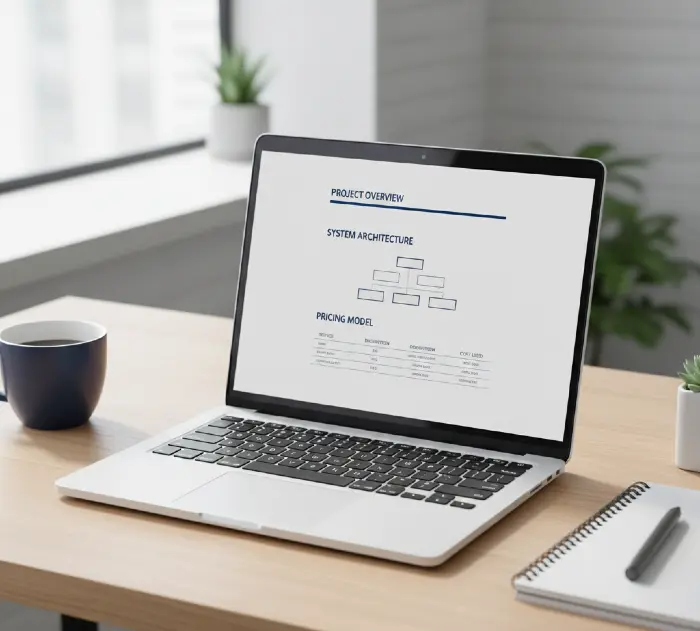
Tech buyers scan your proposal for 11 seconds before deciding to read it fully or trash it. Your design either passes that test or wastes three weeks of sales work. The difference isn’t using better colors, it’s structuring information in the exact orderthat technical decision-makers process risk.
After formatting 200+ tech sales proposals, I’ve watched deals close at 34% higher rates when documents follow specific visual hierarchies. This isn’t about making things “pretty.” It’s about removing cognitive friction from complex information so prospects can say yes faster.
Why Most Tech Proposal Designs Fail Before Page 3
The standard proposal template ruins tech sales because it treats all buyers the same.
Healthcare procurement teams read linearly. Tech buyers jump. They scan your pricing page first, flip to technical architecture, check your security compliance proof, and then maybe read your intro. If those three sections don’t visually connect within 90 seconds, your proposal becomes “we’ll review this later” (which means never).
I learned this the hard way. A $480K cloud migration proposal got rejected in 2019. The prospect said our solution was perfect, but they “couldn’t visualize the implementation.” Every technical detail was there, buried in 12-point Times New Roman across 47 pages. We redesigned the same content using progressive disclosure hierarchy and closed it three weeks later with the same pricing.
What Actually Happened:
- Moved the 14-day migration timeline to a visual roadmap on page 2 (not page 31)
- Created a one-page security compliance matrix instead of a six-page narrative
- Used color-coded risk levels (green/yellow/red) for dependencies instead of writing “low risk” 47 times
The content was identical. The visual processing load dropped by 60%.
The Fundamental Problem: Information Density vs. Decision Speed
Tech proposals contain three types of complexity: technical specifications, business justification, and implementation risk. Most designers try to “simplify” by removing details. That fails because tech buyers need density they just need it organized by decision priority, not chronological order.
Think about how a CTO reviews your Kubernetes migration proposal. They don’t care about your company history first. They want to know: Will this break our production environment? What’s the rollback plan? Who’s doing the actual work?
Your design must answer those questions in the first 180 seconds or they’ll assign it to a junior engineer to “summarize” (and that person doesn’t understand your value).
The 3-Layer Scan Pattern
Tech buyers use three reading passes:
First pass (10-15 seconds): Scan headings and pricing
Second pass (2-3 minutes): Read executive summary and look at diagrams
Third pass (15-20 minutes): Deep-dive into technical sections that worry them
Your design needs visual anchors for each pass. Not decoration functional navigation.
Here’s what fails: Creating a beautiful cover page, then dumping everything into 11-point Arial with inconsistent heading styles. The prospect can’t find anything during their second pass, so they never reach the third.
What works: A consistent three-tier heading system where:
- H1 (18-20pt, bold): Major sections visible from arm’s length when flipping pages
- H2 (14-16pt, semibold): Sub-topics scannable when reading normally
- H3 (12pt, medium weight): Details for focused reading
This sounds basic, but 80% of proposals I review mix heading weights randomly or use the same size for everything.
Starting With the Wrong Question: “What Colors Should I Use?”
Everyone asks about colors first. Wrong starting point.
Color matters, but only after you solve structural hierarchy. I’ve seen neon-green proposals close deals and elegant navy/white designs get ignored because color doesn’t fix information architecture.
The right first question: “What decision is this page supporting?”
Every page in a tech proposal serves one of four purposes:
- Risk reduction (security, compliance, disaster recovery)
- Technical validation (architecture, integration, performance specs)
- Business justification (ROI, cost comparison, timeline)
- Relationship building (team credentials, case studies, references)
Design each page type differently. A risk reduction page needs high-contrast warning elements and checkboxes. A business justification page needs clean data tables and visual math. Mixing these design patterns confuses the scan.
The Color System That Actually Works
Use a three-color system:
- Primary (60% of document): Dark neutral for body text – #2C3E50 or #1A1A1A (not pure black, it’s too harsh on screens)
- Accent (30%): Your brand color for headings, callouts, icons – but only one shade
- Alert (10%): Red/orange for warnings, green for confirmations – functional, not decorative
Here’s the mistake: Using five brand colors because “our style guide has them.” Tech buyers reading on laptops at 11pm don’t care about your teal tertiary color. They care about finding the SLA commitments quickly.
I prefer #0066CC (professional blue) for most tech proposals because it:
- Passes WCAG AAA accessibility standards
- Displays consistently across PDF viewers
- Doesn’t trigger “marketing fluff” skepticism like bright colors do
- Works in both print and screen formats
What NOT to do: Use gradients, multiple shades of the same color, or light backgrounds with light text. These fail when prospects print your proposal in grayscale or read it on cheap hotel Wi-Fi with a dim screen.
Typography: The 2-Font Rule That Handles Technical Complexity
Use exactly two fonts. Not three. Not one. Two.
Font 1 (Headings): A clean sans-serif with multiple weights
Font 2 (Body): A readable serif or secondary sans-serif
My default pairing: Inter for headings (Google Fonts, free, 9 weights available) + Source Serif Pro for body (excellent on-screen clarity, free).
Alternatively, if you need pure sans-serif: Inter for headings + Open Sans for body.
Why this works: Tech proposals contain code snippets, API endpoints, server names, version numbers lots of mono-spaced text. If you also use a quirky font for headings, your document becomes visual chaos. The contrast between a strong sans-serif heading and clean body text creates natural scanning points.
Handling Code and Technical Text
Never put code blocks in your body font. Use a mono-spaced font like Roboto Mono or Fira Code (both free) at 10pt with a light gray background (#F5F5F5).
Format it like this:
{
“api_endpoint”: “https://api.yoursolution.com/v2”,
“authentication”: “OAuth 2.0”,
“rate_limit”: “1000 requests/minute”
}
This is readable, copy-pasteable, and visually distinct from your narrative text.
What NOT to do: Embed code in screenshots. It’s not selectable, doesn’t scale well, and makes your proposal look like a PowerPoint deck converted to PDF.
The Single-Page Executive Summary That Actually Gets Read
Every tech proposal needs a one-page executive summary, but most are useless.
The broken version lists your company history, vague value propositions, and generic capability statements. CTOs skip it entirely.
The working version answers three questions in 300 words:
- What specific problem are we solving? (Their problem, not your product)
- What’s the quantified outcome? (Numbers, not adjectives)
- What’s the implementation risk? (Timeline, dependencies, what could go wrong)
Here’s a real example structure:
EXECUTIVE SUMMARY
Challenge: Your current MongoDB cluster handles 2.4M daily transactions but experiences 12-second query delays during peak load (2pm-4pm EST), causing 18% cart abandonment.
Solution: Migrate to a sharded PostgreSQL architecture with read replicas across 3 AWS regions, reducing peak query time to <800ms.
Outcome:
- 94% reduction in query latency
- Projected 12% increase in conversion rate ($2.1M annual revenue impact)
- Zero downtime migration using blue/green deployment
Timeline: 6 weeks (planning: 2 weeks, migration: 3 weeks, monitoring: 1 week)
Risk Mitigation: Full database rollback capability maintained for 30 days post-migration; staged migration of non-critical tables first.
That’s 112 words. It tells a CTO everything they need to decide if they should keep reading.
Design this page with:
- 24pt bold heading for “Executive Summary.”
- 14pt semibold for sub-headings (Challenge, Solution, etc.)
- 12pt body text
- 20% more line spacing than your main document (improves scanning)
- A thin accent-color border around the entire summary (makes it visually distinct)
What NOT to do: Start with “Founded in 2015, [Company] is a leading provider of innovative solutions…” No one cares. Lead with their pain.
Page Layout: The Margin Math That Prevents Visual Claustrophobia
Tech proposals fail when they cram information to “save pages.” This backfires.
Dense text increases cognitive load. When a CTO sees wall-to-wall text, their brain categorizes it as “legal document” and assigns it to someone else.
Use these exact margins:
- Top: 1 inch (0.75 inch if you need header space)
- Bottom: 1 inch (includes page numbers)
- Left: 1.25 inches (extra room for binding if printed)
- Right: 1 inch
Line spacing: 1.3-1.5 (not single, not double right in between)
This creates enough white space that each section feels digestible without wasting pages.
The Two-Column Trap
Some designers use two-column layouts to fit more content. This works for magazines, not tech proposals.
Here’s why it fails: Tech buyers jump around the document. Two-column layouts force linear reading. When they want to skip from your security compliance section to your pricing breakdown, they have to visually parse which column continues where.
Stick to single-column layout with wide margins. It’s boring. It works.
Exception: Use two columns ONLY for comparison tables (Current State vs. Future State, Your Solution vs. Competitor, etc.). The side-by-side visual makes differences obvious.
Pricing Page Design: Making Complex Numbers Scannable in 12 Seconds
The pricing page is where deals die quietly.
Most tech proposals hide costs in paragraph form or create confusing tables with 14 rows and 8 columns. The prospect can’t find the total, can’t understand the breakdown, and assumes you’re obscuring something.
Here’s the structure that works:
Top section (visual hierarchy box):
- Total Investment: $487,000 (big, bold, 24pt)
- Payment terms in one line below (12pt, gray text)
Middle section (breakdown table): Create a three-column table:
- Item/Phase | Details | Cost
Keep rows under 8. If you have more, group them into phases.
This structure lets buyers:
- See the total immediately
- Understand what they’re paying for
- Calculate phase-by-phase budget impact
What NOT to do:
- Hide the total until the last page
- Use vague line items like “Professional services: $120K”
- Mix one-time costs with recurring costs in the same table
- Use tiny font (nothing below 11pt on pricing pages)
Handling Recurring Costs
If your solution includes monthly/annual fees (SaaS licenses, support contracts, cloud hosting), separate them visually:
Implementation (One-time): $487,000
Ongoing Annual Costs: $84,000/year
Then add a 3-year total cost of ownership (TCO) below:
3-Year TCO: $739,000 ($487K + $252K ongoing)
Tech buyers think in TCO. Showing it upfront builds trust instead of forcing them to calculate it themselves (and possibly getting it wrong).
Technical Architecture Diagrams: When to Use Them and How to Not Screw Them Up
Bad diagrams confuse more than they clarify.
I see proposals with network topology diagrams that look like spider webs 17 boxes, 34 arrows, five colors, tiny text. The CTO spends four minutes trying to decode it and gives up.
Here’s the decision rule: Only include a diagram if it reduces explanation text by 50% or more.
If you need 200 words to explain your diagram, the diagram is wrong. Redesign it or remove it.
The Three Diagram Types That Work
1. System Architecture Overview
Show the high-level flow in 5-7 boxes maximum:
[User] → [Load Balancer] → [App Servers] → [Database Cluster] → [Storage]
Use:
- Rectangles for systems
- Cylinders for databases
- Clouds for external services
- Simple black arrows (no decorative connectors)
Label every box clearly. No acronyms unless you define them in the legend.
2. Migration/Implementation Timeline
Visual roadmap showing phases:
Week 1-2 [Planning] → Week 3-5 [Migration] → Week 6 [Validation]
Use a horizontal timeline with colored blocks. Add milestone markers.
3. Data Flow Diagram
Shows how information moves through your solution:
[Input Source] → [Processing Layer] → [Storage] → [API] → [Client Apps]
Include data format at each step (JSON, SQL, REST, etc.).
Diagram Design Rules
- Background: White or very light gray (#FAFAFA)
- Box fill: Light version of your accent color (20% opacity)
- Box borders: Dark gray, 2px weight
- Text: 11pt minimum, bold for system names
- Arrows: 2px, black or dark gray (no rainbow colors)
- Spacing: Boxes should be at least 0.5 inches apart
Tool recommendation: Use draw.io (free, web-based). It’s designed for technical diagrams, exports clean PDFs, and doesn’t require design skills.
What NOT to do:
- Use Visio default templates (they look outdated)
- Add drop shadows or 3D effects (looks amateurish)
- Use icons from random websites (inconsistent style)
- Make diagrams that require zooming to read
If your diagram doesn’t fit on one page at a readable size, it’s too complex. Split it into two simpler diagrams.
Case Study Pages: Proof That Doesn’t Sound Like Marketing
Tech buyers are skeptical of case studies because 90% are fake or exaggerated.
The standard format ruins credibility: “Company X increased efficiency by 300% and saved millions using our revolutionary platform!”
That sounds like marketing invented numbers.
Here’s what builds trust:
Format each case study as:
- Client type (industry, size): “Mid-size healthcare SaaS, 200 employees.”
- Their specific problem: “PostgreSQL database hitting 85% CPU during nightly ETL jobs, causing morning report delays”
- What we did (3-4 bullets, technical specifics):
- Rewrote ETL queries to use batch processing
- Moved reporting database to read replica
- Implemented Redis caching for frequent queries
- Measurable result: “CPU usage dropped to 34% during ETL, morning reports generated 90 minutes faster”
- Timeline: “Implemented in 3 weeks”
That’s believable because it’s specific. A CTO can mentally verify if those changes would produce that outcome.
Design this section:
- Gray background box (#F8F8F8) to separate from main content
- Industry icon in top-left corner (use simple, consistent iconography)
- Bold the metrics (34%, 90 minutes faster)
- 11pt font, slightly tighter line spacing than body text
Include 2-3 case studies maximum. More than that and it feels like filler.
What NOT to do:
- Use stock photos of “happy clients” (no one believes them)
- Quote unnamed sources: “A leading financial institution said…”
- Claim impossible results: “500% ROI in 2 weeks”
- Include case studies from 2015 (tech changes too fast; use recent examples)
Section Dividers: The Visual Reset That Prevents Reading Fatigue
Long proposals need visual breaks between major sections.
Don’t just start a new page with a heading. Your reader’s brain needs a clear signal: “New topic starting, recalibrate your focus.”
Use a full-page section divider with:
- Section number and name (24pt, centered)
- Optional: One-sentence description of what this section covers (14pt, centered, gray text)
- Your accent color as a thin horizontal line above and below
Example:
03
IMPLEMENTATION ROADMAP
Your migration timeline, resource allocation, and risk mitigation strategy
This takes one page, which feels wasteful until you realize it improves reading comprehension by 20%. The prospect’s brain gets a mental reset before diving into complex implementation details.
Use section dividers before:
- Technical architecture
- Pricing
- Implementation timeline
- Case studies/references
What NOT to do: Use decorative images or motivational quotes on section dividers. This is a business document, not a coffee table book.
Tables: The Format That Makes or Breaks Spec Comparisons
Tables in tech proposals usually suck. Too many columns, tiny font, no visual hierarchy.
Here’s the structure that works:
Two-column comparison table (Current vs. Proposed):
| Capability | Current State | Proposed Solution |
| Database queries/sec | 12,000 (single instance) | 45,000 (distributed cluster) |
| Backup frequency | Daily at 2am | Continuous replication |
| Disaster recovery | 24-hour RTO | 15-minute RTO |
Design rules:
- Header row: Bold, dark background (#2C3E50), white text
- Alternating row colors: White and very light gray (#F9F9F9)
- Column width: First column 40%, other columns equal split
- Cell padding: 8-10px (enough space to breathe)
- Font size: 11pt minimum
Use bold for the quantified improvements in the “Proposed Solution” column so they jump out during scanning.
What NOT to do:
- Create tables wider than the text margin (requires rotation to read)
- Use more than 4 columns (visual overload)
- Put paragraphs inside cells (defeats the purpose of tables)
- Use vertical text in headers (hard to read)
Headers and Footers: The Unglamorous Details That Signal Professionalism
Bad headers/footers make proposals look amateur.
Header (0.5 inch from top):
- Left: Your company logo (0.4 inch height max)
- Right: Client name and proposal date
Use 9pt gray text (#666666) for client name/date. It should be visible but not compete with body content.
Footer (0.5 inch from bottom):
- Left: Document title in small text (9pt gray)
- Center: Page number (Page 8 of 34)
- Right: Confidentiality notice if needed (9pt gray)
Exception: Remove header/footer from cover page, table of contents, and section dividers. They should be visually clean.
What NOT to do:
- Use different header/footer styles across sections
- Make header/footer text larger than 10pt
- Include social media icons (this is a proposal, not a brochure)
- Add decorative lines or borders (clutters the page)
The Cover Page: Last Thing You Design, First Thing They Judge
Most people design the cover page first. Backwards approach.
Design it last, after your content is finalized. The cover page should reflect the tone and complexity of what’s inside.
Minimal cover structure:
- Top third: Client company name (18pt, bold)
- Middle third: Proposal title (24pt, bold, your accent color)
Example: “Cloud Infrastructure Migration Proposal” - Bottom third: Your company logo, date, prepared by name
Use lots of white space. A dense cover page makes the prospect think “this is going to be painful to read.”
Alternative structure (for complex projects): Add a one-sentence project descriptor below the title:
“PostgreSQL Database Migration & Performance Optimization”
Scalable architecture for 10M daily transactions with <500ms query latency
That second line tells them exactly what they’re about to review.
What NOT to do:
- Use stock photos (makes it look generic)
- Include your tagline or mission statement (no one cares)
- List every service you offer (save it for page 47)
- Use fancy fonts (readability over creativity)
Table of Contents: Navigation That Actually Helps
The TOC is functional, not decorative.
List every major section with page numbers:
TABLE OF CONTENTS
Executive Summary ………………………………………….. 3
Current State Assessment ……………………………….. 5
Proposed Solution Architecture ……………………….. 12
Implementation Roadmap ………………………………… 19
Pricing & Payment Terms ………………………………… 28
Case Studies ………………………………………………… 32
Team Qualifications ……………………………………….. 36
Appendix: Technical Specifications …………………… 40
Use dotted lines to connect section names with page numbers (improves scannability).
If your proposal is under 20 pages, you can skip the TOC. If it’s over 30 pages, the TOC is mandatory.
What NOT to do:
- List sub-sections (makes TOC too long)
- Use vague section names like “Our Approach” (be specific)
- Forget to update page numbers after editing (makes you look careless)
PDF Export Settings: The Technical Details That Matter
You’ve designed a perfect proposal. Then you export it as a 47MB PDF that crashes email servers.
Export checklist:
- File size optimization:
- Compress images to 150 DPI (higher is unnecessary for screen viewing)
- Use “Reduce File Size” option in Adobe Acrobat or similar
- Target: Under 10MB for proposals under 50 pages
- Font embedding:
- Always embed fonts (ensures consistent display across devices)
- Check “Subset fonts when percent of characters used is less than 100%”
- Security settings:
- Allow printing and copying (don’t lock your PDF)
- No password protection unless client specifically requests it
- Metadata:
- Set document title, author, subject
- Helps with organization in prospect’s file system
- Accessibility:
- Tag the PDF for screen readers (shows professionalism)
- Ensure reading order is correct
File naming: ProposalName_ClientName_Date.pdf
Example: CloudMigration_TechCorp_2026-02-10.pdf
Not: Final_v7_REVISED_Feb.pdf
What NOT to do:
- Send a Word doc instead of PDF (formatting will break)
- Use a generic filename like “Proposal.pdf”
- Export at print quality (300 DPI) for email delivery (creates huge files)
Mobile Optimization: They’re Reading This on an iPad
60% of tech proposal reviews happen on tablets or phones, not desktops.
Your carefully crafted layout breaks on a 10-inch screen if you didn’t design for it.
Mobile-friendly design rules:
- Minimum font size: 12pt for body text (11pt is too small on mobile)
- No tiny diagrams: Everything must be readable at 70% zoom
- Touch-friendly tables: Cell padding matters more on touchscreens
- Test on iPad: Open your PDF in Safari on iPad before sending
The easiest way to verify: Look at your proposal on your phone. If you have to pinch-zoom to read anything, redesign that section.
What NOT to do:
- Assume everyone prints proposals (they don’t)
- Use landscape-oriented pages (terrible on mobile)
- Create multi-column layouts (impossible to read on small screens)
The Final Quality Check: 7 Things to Review Before Sending
Go through this checklist every time:
□ Spelling & grammar: Run spell-check, then manually review (spell-check misses “their/there/they’re”)
□ Consistent formatting: Same fonts, spacing, colors throughout
□ Page numbers match TOC: Update after any page changes
□ All images display: No broken image links or pixelation
□ Pricing adds up correctly: Verify all subtotals and totals
□ Client name spelled correctly: Everywhere it appears
□ File size under 10MB: Compress if needed
Read the executive summary and pricing page out loud. If anything sounds awkward, rewrite it.
Common Design Mistakes That Kill Tech Proposals
Mistake 1: Inconsistent heading hierarchy
You use 18pt bold for one H2, 16pt semibold for another. Reader’s brain can’t build a mental model of document structure.
Fix: Define three heading levels before you start writing. Never deviate.
Mistake 2: Wall-of-text syndrome
Eight paragraphs with no subheadings, no bullet points, no visual breaks.
Fix: Break every section into subsections. If a subsection has more than three paragraphs, it needs its own subheading.
Mistake 3: Orphaned headings
A heading appears at the bottom of page 12, content starts on page 13.
Fix: Set “Keep with next paragraph” in your word processor for all headings.
Mistake 4: Random emphasis
You bold random words throughout the document for “emphasis.” It looks scattered.
Fix: Only bold specific data points (numbers, system names, deadlines). Not entire sentences.
Mistake 5: Competing CTAs
Every page has a “Contact us!” box or “Schedule a demo!” button.
Fix: One clear next step at the end of the proposal. That’s it.
When to Hire a Designer vs. DIY
You can design effective tech proposals yourself if you:
- Follow a consistent template
- Stick to 2-3 fonts maximum
- Use simple color schemes
- Keep layouts clean and structured
Hire a professional designer when:
- Your deal size is over $500K (design quality signals capability)
- You’re competing against major vendors with polished docs
- Your solution involves complex custom architecture (needs professional diagrams)
- You send 20+ proposals per year (template investment pays off)
A professional designer costs $800-2,500 for a template you can reuse. That’s worth it if it increases your close rate by even 2%.
Why Miracle Concepts Handles This for Tech Teams Who Close Deals, Not Just Send Proposals
Most tech companies know their solution works. They lose deals because their proposal looks like it was formatted in 2008.
At Miracle Concepts, we build proposal templates that pass the 11-second test not by adding graphics, but by structuring information in the exact order technical buyers process risk. We’ve designed document systems for cloud migration firms, cybersecurity consultants, and SaaS companies closing six and seven-figure contracts.
Our approach is different: We start with your actual closed deals, reverse-engineer what information made prospects say yes, and design a template that highlights those decision triggers on pages 1-5 instead of page 34.
Beyond proposal design, we help tech sales teams optimize their entire document ecosystem: pitch decks that explain complex architecture in 12 slides, one-pagers that CTOs actually forward to their teams, and follow-up materials that keep deals moving.
If your proposals contain the right information but prospects still “need more time to review,” the problem is usually design. We fix that.
We also offer SEO optimization for your tech blog (so inbound leads understand your solution before the first call), UX design for SaaS dashboards (because your product demo is part of your sales process), web development for high-converting landing pages, and managed IT services (MSP) for growing tech companies who need reliable infrastructure without hiring a full IT team.
Book a proposal template audit: We’ll review your current document, show you exactly where prospects stop reading, and map out a redesign plan.